Introduction
Redesigning Casa's online experience
As part of the scrum team, I worked with a UX researcher to redesign Casa’s site, enhancing the visual design and flagship product pages, and improving UX within logistical constraints.
Project goals
Create a fresh and modern visual design language for the e-commerce shop that aligns with the brand identity and business goals.
Create a design library that can be easily scaled and adapted to accommodate future business needs or additions to the e-commerce shop's features and functionalities.
Implement effective information architecture and navigation design to improve the discoverability of products and services on the e-commerce shop.
Collaborate closely the with the scrum team of developers and Product Owner to ensure that the redesign is technically feasible and efficiently implemented.
Foundations
Setting up the foundations
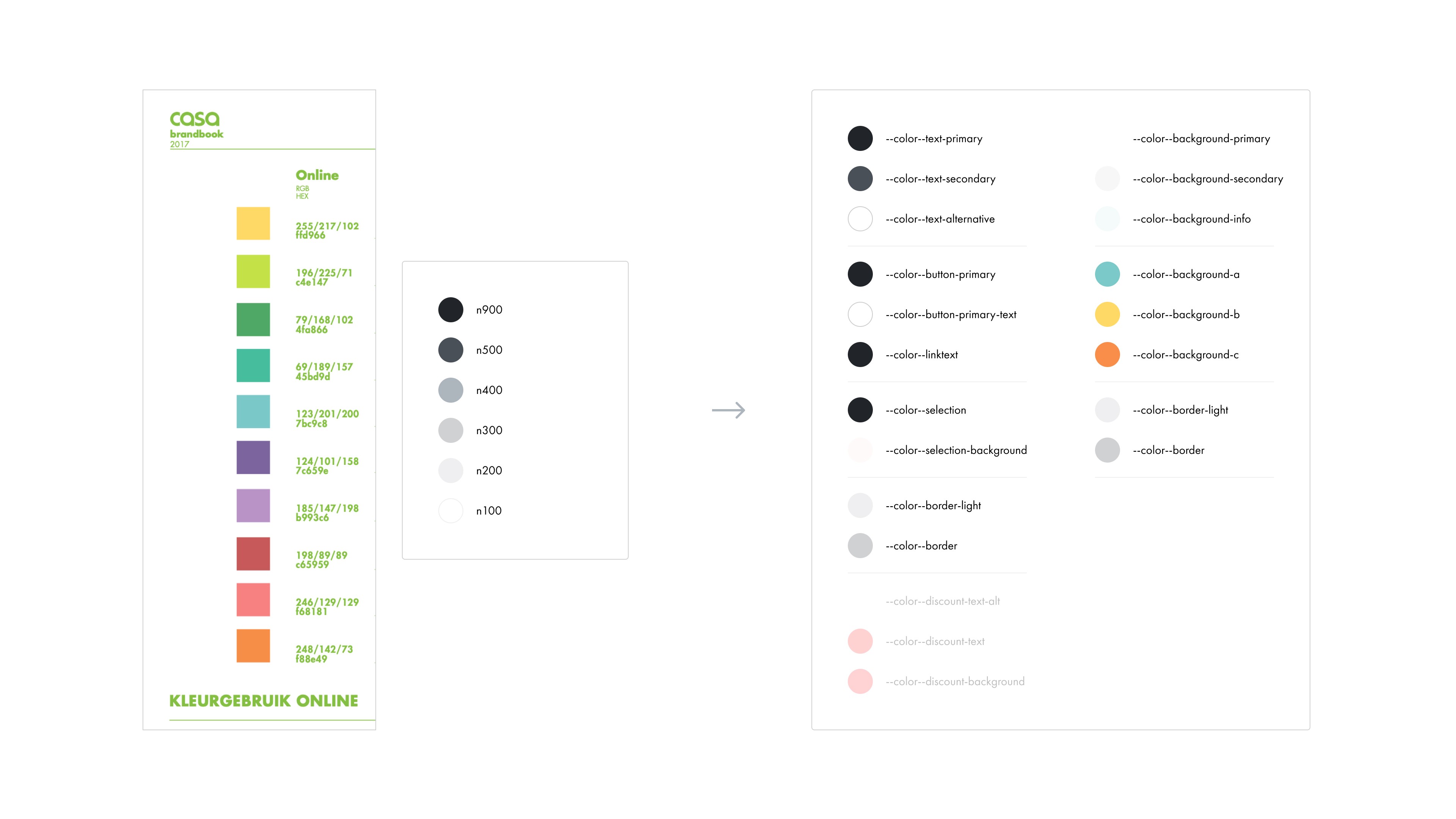
The existing website had no design library and numerous interface inconsistencies, resulting in poor accessibility. I addressed these by creating a new UI library and developing a color system with design tokens.

Navigation
Enhanced navigation and search functionality
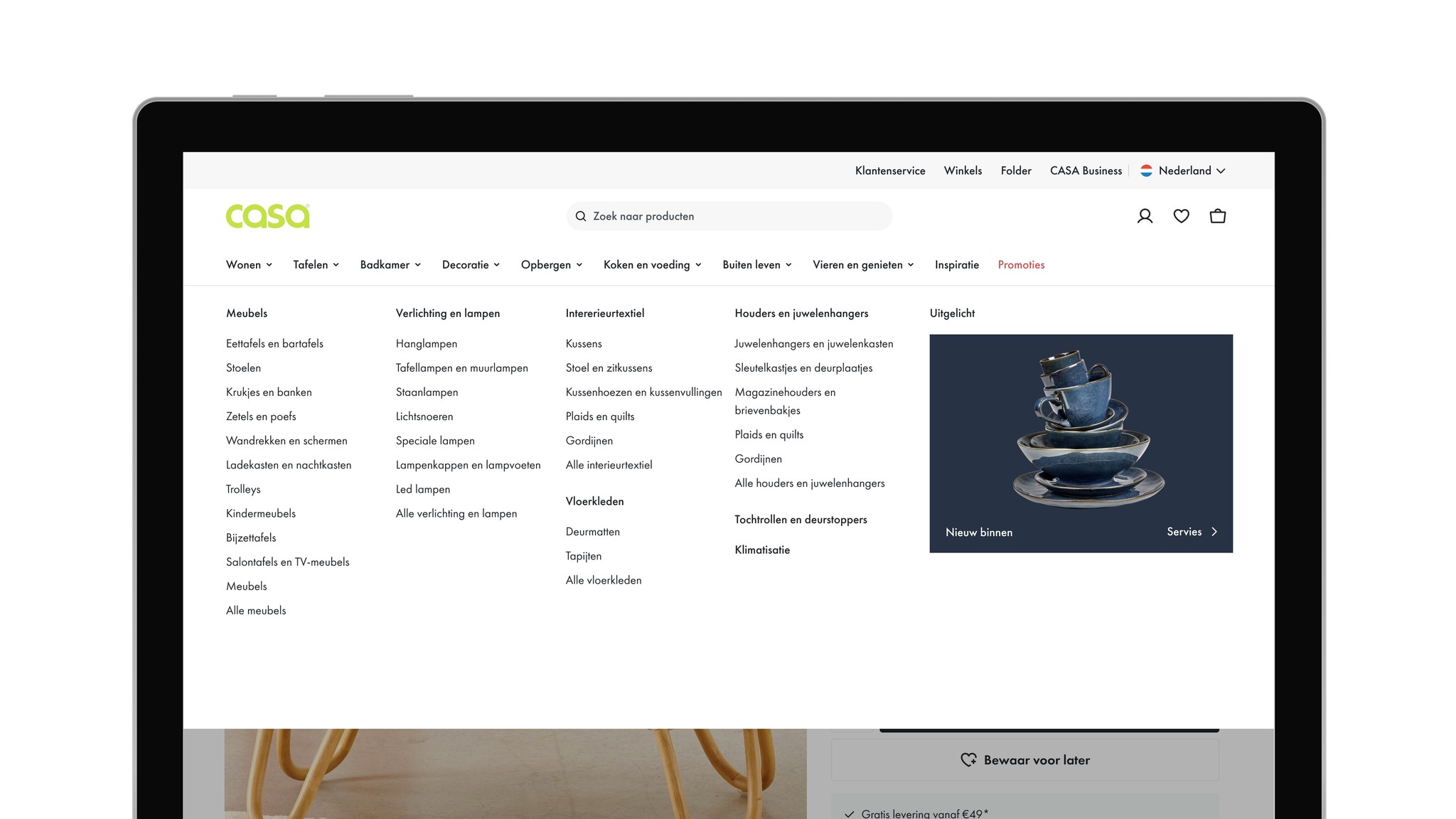
The navigation and search functionality needed improvement across breakpoints and devices. In the new design, I used clear icons with text labels and common design patterns to make product categories clearer and easier to navigate.



Check-out
Optimized for delivery and pick-up options
By cutting out clutter, we made the checkout process smoother without changing the basic business operations.

Product details
Enhanced product info and variant selection
For the product detail page, we completely revamped the layout. We improved how product information is displayed, added support for store pick-up, and enabled selection of product variants.




Product details
Enriching flagship product pages with content components
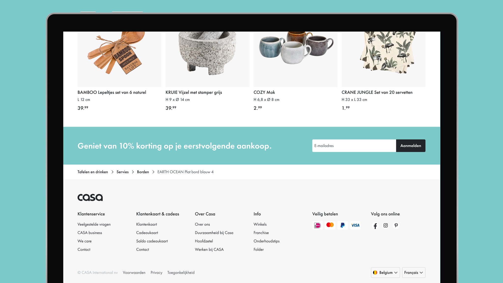
As part of the product detail page redesign, we enabled CASA to enrich specific products with content components that highlight detailed product information and visuals.
Product lister
Improving product lister for availability and product filters
For the product lister, we iterated to account for limited online availability and category-based filtering. Most products featured both studio and real-life imagery. We experimented with a toggle to let users choose their preferred image type.


My account
Improved account management with order status and wishlist functionality
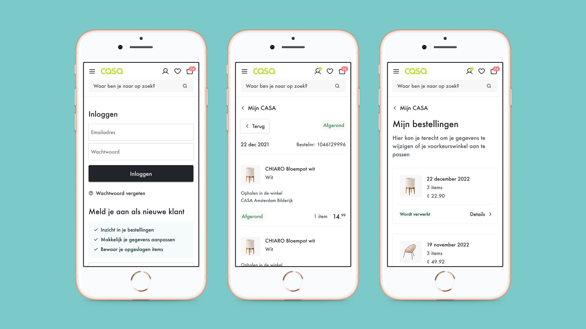
The new design for the “My Account” section includes a visual revamp, added access to the wishlist, and enhanced order insights. The updated order overview is more detailed, showing order status and allowing for mixed single orders with combined pick-up and delivery options.




Basket
Handling delivery and pick-up options in Basket
One of the challenges in the basket design was managing order pick-up and online delivery options. Due to stock availability, changes weren’t always possible and had to be handled smoothly to avoid disrupting the user experience.

